4 Impressive Blog Designs
What is a blog? What are the main features of a blog? A series of questions arise. According to Wikipedia a blog is usually maintained by an individual with regular entries of commentary, descriptions of events or other materials such as graphics, videos displayed in chronological order. A blog must possess certain good features which must make a person go wow!! Also he should be able to suggest it to others. The first and foremost feature I would look for is the design and its user interface. I hope
What is a blog? What are the main features of a blog? A series of questions arise. According to Wikipedia a blog is usually maintained by an individual with regular entries of commentary, descriptions of events or other materials such as graphics, videos displayed in chronological order. A blog must possess certain good features which must make a person go wow!! Also he should be able to suggest it to others. The first and foremost feature I would look for is the design and its user interface. I hope
What is a blog? What are the main features of a blog? A series of questions arise. According to Wikipedia a blog is usually maintained by an individual with regular entries of commentary, descriptions of events or other materials such as graphics, videos displayed in chronological order. A blog must possess certain good features which must make a person go wow!! Also he should be able to suggest it to others. The first and foremost feature I would look for is the design and its user interface. I hope
What is a blog? What are the main features of a blog? A series of questions arise. According to Wikipedia a blog is usually maintained by an individual with regular entries of commentary, descriptions of events or other materials such as graphics, videos displayed in chronological order. A blog must possess certain good features which must make a person go wow!! Also he should be able to suggest it to others. The first and foremost feature I would look for is the design and its user interface. I hope you agree with me…
There are 4 sites I would like to comment on.
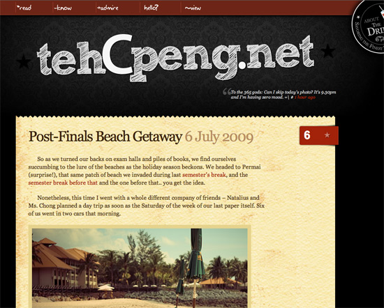
What I liked in this website is its stunning layout. It has a clean web 2.0 layout. Also the content area is very well done, but ofcource the feature that I disliked in this blog is that the main navigation lacks readability. And ofcource it is not good to put the search function in the footer in a blog. (I don’t want to type something to search there). It is not so user friendly.
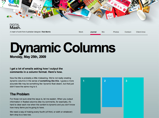
2. http://digitalmash.com/journal/articles/dynamic-columns/
This site has a fresh and modern design. Compared to the previous, it has a really effective and simple navigation. But what I feel can be improvised improved is the typography. There are more blank spaces in the content area.
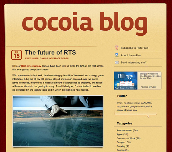
This site also has a web 2.0 layout. Good Typography, easilily easily differentiated entries but again the search field at the footer does not give me a good impression.
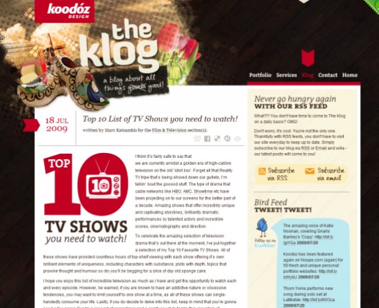
4. http://www.koodoz.com.au/klog/
Here I must mention the design works perfect. Brilliant color combination which brings a fresh feel. Excellent typography, funny but effective navigation. Here the title and the logo failed to get attention.
These are just some comments on the basic design and the user friendliness of few blog sites which is taken randomly from different design magazines. Next I shall give you basic tips on how to improve the design with typography.
Cheers!!
Abdul Musavir is a designer at Bridge India. He gets his inspiration from searching good designs on the internet and will be sharing his most attractive findings regularly with you on the Bridge Blog.
you agree with me…
There are 4 sites I would like to comment on.
What I liked in this website is its stunning layout. It has a clean web 2.0 layout. Also the content area is very well done, but ofcource the feature that I disliked in this blog is that the main navigation lacks readability. And ofcource it is not good to put the search function in the footer in a blog. (I don’t want to type something to search there). It is not so user friendly.
2. http://digitalmash.com/journal/articles/dynamic-columns/
This site has a fresh and modern design. Compared to the previous, it has a really effective and simple navigation. But what I feel can be improvised improved is the typography. There are more blank spaces in the content area.
This site also has a web 2.0 layout. Good Typography, easilily easily differentiated entries but again the search field at the footer does not give me a good impression.
4. http://www.koodoz.com.au/klog/
Here I must mention the design works perfect. Brilliant color combination which brings a fresh feel. Excellent typography, funny but effective navigation. Here the title and the logo failed to get attention.
These are just some comments on the basic design and the user friendliness of few blog sites which is taken randomly from different design magazines. Next I shall give you basic tips on how to improve the design with typography.
Cheers!!
Abdul Musavir is a designer at Bridge India. He gets his inspiration from searching good designs on the internet and will be sharing his most attractive findings regularly with you on the Bridge Blog.


Pingback: Twitted by Bridge_Tweed
Good article Musavir. Waiting for your next POST!!
Nice post :-)The article is good and informative to know the small details required to keep in mind while making a blog in future. Keep it up.
Pingback: NASCAR » Blog Archive » Review of the Sun Fire X2270 and X4270 - Technology
Greetings I am so grateful I found your website, I really found you by accident, while
I was looking on Google for something else, Anyways I am
here now and would just like to say thanks a lot for a incredible post and a
all round thrilling blog (I also love the theme/design), I
don’t have time to go through it all at the moment but I have saved it and
also added in your RSS feeds, so when I have time I will
be back to read much more, Please do keep up the superb work.
hello ,
thanks for sharing the article .this is very helpful for me .please post your and more articles .
thanks for