Web Design Predictions for 2017
Web design standards and trends keep evolving. From functionality to color and typography, 2017 will be a year of new ideas and new visual aspects to explore. New design trendshave already started showing up, presenting us with just enough visual inspiration to get off to the right start in this year. Let’s have a look.
Enhanced design to development workflows
Design and prototyping resources for the web has achieved more maturity and elegance.The common handoff deliverable has passed through the stages of static files to more dynamic visualizations that varies from animated keynote documents to completely functional websites. Dynamic tools like Balasmiq and Invision App shorten the feed-back loop, where designers are ready to rapidly take ideas to life, and this enables everyone to experience them without delay.
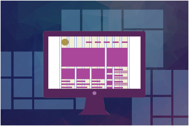
Complex layouts originated in graphic design principles
Referring to the progression of graphic design, for the past few years, web design layout has been confined by the limitations that come in with CSS.But new tools like flexbox (http://flexboxgrid.com/) and also CSS grid (http://gridbyexample.com/) (coming soon!) will make life easy.
SVGs for the web
SVGs provide web designers with a bunch of advantages over more standard image formats like JPG, PNG, and GIF.
The advantages of SVGs are made clear in the name itself: scalable and vector. Preferably raster or pixel-based, SVGs are made up of vectors: numerical descriptions of the object’s shape. SVGs are resolution independent, so we can stop worrying about creating everything retina-ready.
SVGs have a bigger advantage in them not requiring any HTTP requests. If you’ve ever run a page-speed check on one of your websites, you have probably found that HTTP requests can certainly slow down your site. Not so with SVGs!
Focus on animation
Animation has played a major part in our digital interfaces with numerous graphic tools available in the market for the same.
As animation now has become the norm, the latest trend here is to make sure your animation actually relates to your brand promise. At 2016’s Design & Content Conference, held at Vancouver, BC, the highlighted point was that designers would need to look into the tone of the website content and create matching animations. This will ensure that animations perform purposeful, on-brand features for users, rather than for the visual effects alone.
Realistic Mock-Ups
Designers have long used “lorem ipsum” and placeholder images to create designs. 2016 noticed common use of real data (content) in design mock-ups. This trend will be maintained in 2017 and will help design issues to surface early on.
Reduced stock photos, much more accuracy
Another trend on the go is the reduced usage of stock photos.People now prefer to have realistic, unique images that actually relate to an organization, than cold stock photos.Photography is an art form and one which probably got a bit lost over the last years, especially with web designs. But 2017 will see a comeback and considerably more powerful and effective than ever before. Other than realistic images, cartoons, comics, and other illustrations are trending too. A comic reel can be an excellent way to focus on a particular topic or describe a service idea.
Innovative heading styles
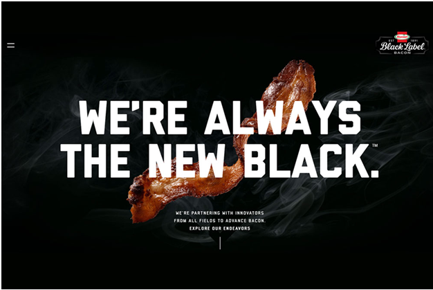
Traditional basic heading structure (san serif, centered heading, all caps) are now making way for more imaginative or creative titles. Giving a creative twist to your headings would be trending point.Here are some examples:
http://blacklabelbacon.com/
http://super16.dk/
Fonts becoming bigger and bolder
Using large bold type is an absolutely excellent way to create designs that look better than ever.
Brand heading will be bigger, eye catching, and also full screen. Dynamic colors and design will be added to fonts to develop an overall incredible effect.
Readability will of course remain a priority and any artwork imbibed into your headings should always be understood at a glance.
Large colored shadows
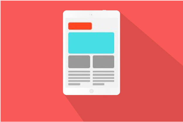
Shadows continue to stay as a creative concept in 2017; creative designers are seeking at more innovative ways of using them in their own designs. A colored background can enhance the shadowed component and provide a captivating element to the visual aspect of the website.


