11 Untapped Web Design Trends in 2020
Web design is a trend you need to keep an eye on. It is continually changing, and the possibilities of these changes are endless. If your current website spots the same look as it did ten years ago, now is the time to check on the latest web design trends you can consider on your site.
Your website can act as your online brochure. Therefore it’s imperative to make it more appealing and presentable. Either you go with minimalism or eye-catching design, you need to understand that whatever design you choose should reflect your brand and values.
This article will find different web design trends that are the latest on the market that market these days that you can consider for your website.
Here’s an insightful read on Tips to Start Your Career as a UI UX Designer in 2020.
Web Design Trends You Should Take Note This 2020
1. Black And White
If you have been used to seeing loud, neon-filled web design in the past, this year, it will be about simplicity and taming down a bit. This trend may always be a part of every year’s trends, but black and white web design will forever remain classy, making it hard to turn over.
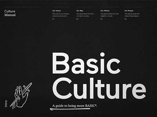
Image Credit: culture.basicagency.com/
While the toning down already started in 2019 with the monochrome era, more and more websites will start to adopt this trend this year. Imagine your site with a clean, crisp, modern, and minimalist feel adorned with images that elude black, white, and gray.
2. Dark Mode
Already adopted by different social media platform applications, dark mode is a trend to look forward to these days. Many are opting to make a switch on the dark mode as it is easy on the eyes. Besides being a cool and modern design, dark mode makes it easier for color and design elements to pop for the design. It makes accent colors more visible that gives an excellent and unique design to your website.
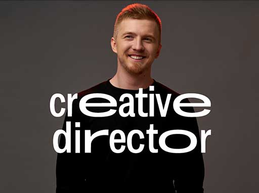
Image Credit: https://kulbachny.com/
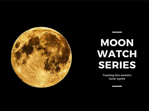
Image Credit: Canva
Dark backgrounds create a high ratio of contrast with other colors, which improves your website visually, yet it does not strain the eye. It is also better on some screens as it can extend screen lifespans.
3. Minimalism on a White Background
While dark mode and black background are gaining popularity, the opposite side of the color spectrum is still a web design trend this year. The white is back with a kick of minimalism.
Like black and white trends, having a white background is one of the trends that will always stay strong and will always be included in the yearly web design trends list. If you have been leaning on this design for quite a while now, you will need a little rework to make your web design relevant. You can incorporate some of the design that will be mentioned in this article to refresh your website.
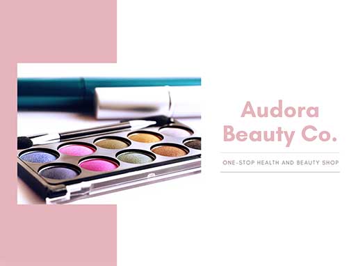
Image Credit: Canva
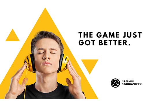
Image Credit: Canva
Moving on to a cleaner, white background, apply minimalism trend by allowing white space to take over your website design. Use a simple font, no matter how big it is, as long as it is simple as you can have it. When a minimalist website is combined with large typography, it can make a bold and more forceful statement. This tactic will allow your website to gain more retention with your audience. Use also a simple photo that rests on a white background, which will help your content garner more attention.
4. Bold Font Sizes
With the simplicity of a black or white background, you can add bold font sizes to catch your audience’s attention. Larger-than-life font sizes will be a web design trend for this year that will allow for robust statements.
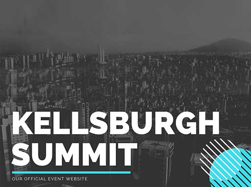
Image Credit: Canva
These fonts can be bold and massive that it can be read from across the room. You can have your company name, featured product, or a service that you need to highlight for nearly half of your home page. These fonts will improve emphasis and retention to your audience.
5. Breaking the Old Font Habits
The year 2020 will be the year of breaking the rules in typography. This year, it will be reasonable to use odd sizing of fonts, uneven lines, and spacing, irregular spacing, and make your typography as art itself without losing the touch of simplicity and minimalism.
Fonts that change color depending on the placement and emphasize a layered effect will be a typical type of design for most websites these days. Because of a minimalist and clean background, even if you apply flips, turns, and twist on your typography, it will come together with your design. It will not be too noisy for your visitor’s eye and will still be readable.
6. Text-Only Design
Besides the massive-sized and artsy fonts, typography will take center stage as a web design trend by being alone on web pages. Remove your website background, add a font that embodies your brand’s unique character, and let it work for you.
Image Credit: Canva
To make your design a bit more fun, you add a color-changing background that can be a good idea. Choose fonts that show your personality without overdoing your design.
7. Hand-drawn Icons
You are not the only one in the neighborhood trying to win your audience with your website design. Your competitors are doing the same and trying to outdo you. With the growing competition, you need to stand out and show off your brand personality. To help you do this, you can incorporate another rule-breaking web design trend – having hand-drawn icons and illustrations that will add life to your website.
![]()
Image Credit: Canva
![]()
Image Credit: Canva
Aside from an option to add artsy typography design in your site, you can also inject personality to your website by having imperfect and hand-drawn design elements. Your visitors will most likely find this appealing as it adds human touch to your site. Hand-drawn icons can add a positive feel to your web design while making you stand out in the competitive pit. These icons can also be easily associated with your brand, contributing to high audience retention.
8. Illustration and Realism
If you’re getting confused about whether to use real image or illustration as part of your web design, you can use both. This year, many will be seen using both illustrations and real-life photos on their websites. Another way of breaking the old rules of web design, yet is a funky and refreshing way of showing your personality and making you stand out from the rest of your competitors.
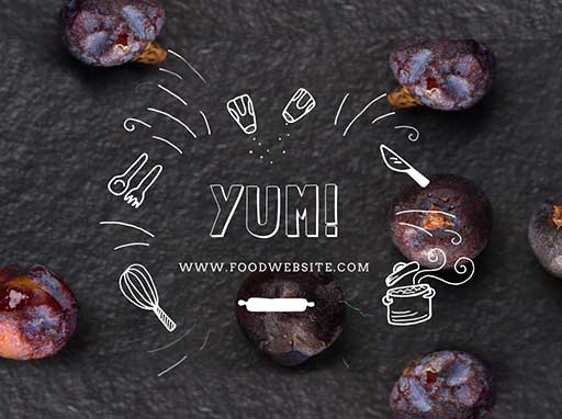
Image Credit: Canva
Using both can help you connect with your audience better as both can demonstrate to your audience your brand’s personality. People can interpret these designs, making it easier for them to understand what you offer. Because you are using photography and illustration elements, it is playful and sophisticated at the same time.
9. Growth Of 3D
Catching your visitors’ interest is another job for your web design. To do this, you need a design that can immerse your audience and recurring visitors on your site. One trend that will help you achieve this is by incorporating 3D in your web design. 3D design aids in improving your visitors’ engagement with your site. Not only aesthetically pleasing on the eye but having a 3D design on your website can also be an advantage for having a positive user experience (UX).
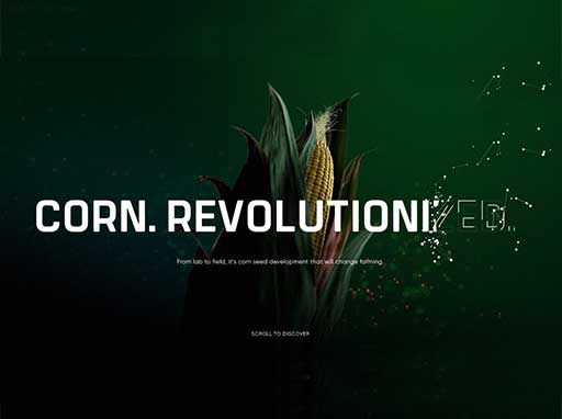
Image Credit: www.awwwards.com
There are two types of 3D designs you can incorporate. One is leaning on interactive 3D effects, which will make your site more engaging. This design effect will encourage your visitors to stay longer on the website. You might also want to leverage static 3D models that will keep your website looking clean, balanced, and modern. You can impress your visitors with realistic looks, mesmerizing colors, and smooth shapes.
10. Floating elements and soft shadows
If you want to create depth in your design, yet you do not want to immerse with 3D effects, you can still do it with soft shadows and floating elements. Using this web design trend can also catch the interest of your website’s visitors.
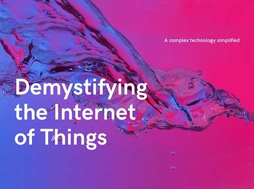
Image Credit: Canva
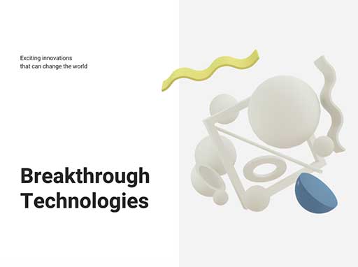
Image Credit: Canva
To do it, you can just add soft drop shadows and any layering element on top of each other. This design trend can make your website appear lightweight as the details look like flying above each other. It is a good take against the usual web design that seems flat and dull.
11. Glowing Schemes
While overcrowded neon patterns and icons may be a thing of the past in your web design, you can still have these color schemes but on a different take. This year, your website can be a glowing sphere by adding glow-in-the-dark neons that work very well with the dark, muted backgrounds.
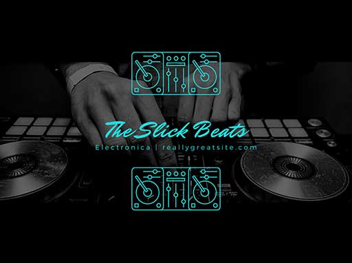
Image Credit: Canva

Image Credit: Canva
These luminous designs can create a futuristic feel on your website, add personality and depth. It can give your site a very visually attractive interface that can be part of your branding strategies. Paired with the dark mode and minimalistic trends, these neon effects and highly saturated colors can pop and give your website a glowing effect that will make your brand shine.
Final Thoughts
This year, web design trends may be a bit more experimental than usual. It is more courageous and bold to break old rules and habits that will make a particular website stand out. For your takeaway, do not be afraid to come out of the box and try to experiment. Mix and match these trends and come up with the best design you think will best suit your website.
However, remember that your design should always embody your brand and your brand’s personality. Finding the right web design may be overwhelming, but as you get to know your brand’s unique proposition, it will be easier for you to find the best design elements to incorporate into your website.
Want to revive your brand with an updated/ fresh website that captures customer attention and improves retention? Contact Bridge Global, a leading UI/UX web design and development company in the US and the rest of the world.


